Thursday, December 4, 2014

Windows 10 is all the rage these days. For those who are excited about Windows 10′s aesthetics, a Windows 10 Transformation UX Theme Pack has been released and shall dress your Windows XP, Vista, 7, 8, and 8.1 in all the makeup required to walk the Windows 10 ramp.
There are a number of Windows 10 transformation packs out there but ‘UX’ pack is this package’s ability to make changes to your Windows installation without patching the system files, making the transformation pack less likely to cause system issues.
 This new Windows 10 Transformation/UX Pack carry the same installation procedure be it on Windows XP or Windows 8.1. As with most transformation packs, this one takes you through the setup allowing you to choose the customizations you want made to your existing Windows, but if that confuses you, you can always go the default way, which should be fine for most novice users.
 The setup integrates new themes, wallpapers, icons, fonts, sounds etc. along with various third party tools to emulate certain looks and functions of Windows 10, such as the new Start Menu. You might think that it’s the same that is to be found on previous version of Windows, but in reality it is the new Windows 10 Start Menu with tiles which gives Windows 8 and 8.1 users a good chance to experience the new look and feel of the OS without actually installing it.
 No transformation pack would be complete till it offered a comprehensive ability to allow the user to roll back to the original settings, and this one is no different. It features a complete uninstall option to take you back to the previous state.
 Windows 10 is currently available as a Technical Preview build for testing purposes only. If downloading and installing the Technical Preview is too much of a work for you, you can take the easier approach by downloading the transformation pack from here, something that you can easily remove later.
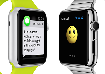
The cat’s out of the bag, and Apple has made its new wearable device official, which is being dubbed as: Apple Watch. We have all the details and everything you need to know right after the break.

Features and Specs
Design
The Apple Watch features a slick, and rather traditional design, and since it’s the first ever smartwatch coming out of Cupertino, we’re dead sure that critiques will go at it with their axes and spears.
Cupertino’s new smartwatch comes with a square face – sorry Moto 360 fans – and features a beautiful sapphire display at the front.
Moving to the side of the device, we’re treated with what Apple is dubbing as the ‘digital crown’, which is the go-to button for many tasks, such as zooming in, scrolling, going back a menu, etc.
The Apple Watch has been designed in such a way that it’s fit for pretty much any occasion, which is, obviously a good thing in our books.
And yes, in case you’re wondering, the Apple Watch is indeed water-proof, and is ready to take a few splashes here and there in your everyday routine.
The Apple Watch will be available with 6 different types of straps, so you can put your mind at ease that Cupertino’s smartwatch will get a tinge of boringness over time.
Taptic Engine:
Its Apple’s haptic feedback system for the Apple Watch. It taps you on the wrist whenever you receive a notification or an alert.
Taptic Engine creates a discreet, sophisticated, and nuanced experience by engaging more of your senses. It also enables some entirely new, intimate ways for you to communicate with other Apple Watch wearers. You can get someone’s attention with a gentle tap. Or even send something as personal as your heartbeat.
Display
The Apple Watch has a rather small touch-screen display, therefore it does not support multi-touch gestures and such, but, to overcome this issue, this is where the ‘digital crown’ comes in, as we mentioned above.
The display of the device wakes up automatically as soon it senses movement, which is a big plus, considering it doesn’t involve the rigmarole of pressing buttons and such.
Charging
The Apple Watch uses MagSafe to charge up, the connector for which goes on the back of the smartwatch. So yes, there’s no wireless charging which users were hoping for.
Software
The Apple Watch runs custom designed software, which has been tailor made for a device of this nature, and instead of relying on taps and button presses, most of the notifications can be interacted with using voice.
And since voice plays a huge role on the Apple Watch, therefore Siri has been thrown into the mix and is ready to take up your queries on a moment’s notice.
Just like any other smartwatch, the Apple Watch will push all notifications from your iPhone to your wrist, and unlike a Pebble smartwatch, the notifications are actionable, and you can send off replies without having to touch your smartphone. Pretty slick.
There are a bunch of watch faces thrown into the mix, ensuring that your wrist worn gadget doesn’t get boring as it sees daily used.
Apart from voice interaction, users have the option to doodle on the display to interact with notifications, but considering the small size of the display, what more could we ask for, right?
And since the Apple Watch is also a fitness ‘band’, therefore a dedicated workout app is also thrown into the mix. Want to track running, cycling or just walking? It’s all there under the hood.
Also included in the support for emojis, custom animated emojis, voice navigation using Maps, phone dialing, email, Mobile payments using Apple Pay, Calendar, Passbook, controlling music, Apple TV, iTunes, Photos, Weather, Stocks, World Clock, Timer Stopwatch, Alarm, Remote Camera, Walkie-Talkie, and more.
WatchKit
Using WatchKit, developers can extend the functionality of their apps to the Apple Watch in App Store. So yes, you’ll be able to create notes on Evernote, send replies to your WhatsApp or Facebook contacts, etc.
Sizes
The Apple Watch will be available in two different sizes, so yes, if you have a smaller wrist, then you don’t need to panic.
Different Models


The Apple Watch won’t be a lone device, and will come in 3 different models:
  • Apple Watch
  • Apple Watch ‘Edition’ – features 18 karat gold casing
  • Apple Watch Sport
All the above models are available in two sizes.
Compatibility
The Apple Watch will be compatible with the following devices:
  • iPhone 6
  • iPhone 6 Plus
  • iPhone 5s
  • iPhone 5c
  • iPhone 5
Price and Release Date
The Apple Watch will start at $349, which is, we’re presuming for the entry level mode, and prices will go up if you’re looking for something a bit more fashionable.
As far as availability is concerned, the Apple Watch will hit shelves in early 2015.


Apple has just released iOS 8.1.1 download links, which are now ready to be installed by iPhone, iPad and iPod touch users in ownership of the recent devices capable of running the latest software.
The Cupertino company has continued to churn out updates to its mobile firmware these past couple of months, and with iOS 8.1 having recently introduced Apple Pay among several other key features, iOS 8.1.1 seems a less feature-rich bump. Still, perhaps most notably for jailbreakers, it plugs the Pangu8 jailbreak, and so while it’s likely Apple will be signing the previous iOS 8.1 for a very short while, anybody updating to iOS 8.1.1 will not be able to reap the benefits of the many Cydia tweaks that have been released and or updated since Pangu arrived last month.

iOS 8.1.1 is packed to the gills with bug fixes and general performance enhancements. Like any new piece of software, iOS 8.x has been afflicted by its fair share of teething issues, and while the botched iOS 8.0.1 update did not help matters at all, it does seem that much work has been done to ensure that the latest installment is by far the smoothest to date.
If you have no reservations about anything and want to update right away then you can take the on-device, over-the-air route by firing up the Settings app and navigating to General > Software Update, or you can take the more traditional route that involves hooking your device up to your PC or Mac and updating via iTunes.
If you have the time and the means, though, we’d always suggest updating through iTunes.
iOS 8.1.1 Download Links:
Again, like we mentioned earlier, iOS 8.1.1 blocks Pangu jailbreak. DO NOT update to 8.1.1 if you want to keep the jailbreak.

Friday, September 5, 2014

It’s no secret that Apple is merging many iOS and OS X features into one seamless experience across devices, and one of these instances – QuickType, the predictive typing feature found in iOS 8 – has recently surfaced in OS X Yosemite.
By pressing the ESC key, Yosemite users can invoke a drop-down menu containing several suggested words that OS X thinks should be typed next. Pressing SPACE BAR will insert the highlighted word along with a space, so users can continue typing or press ESC again for the next suggestion. Note that this is different from a similar feature that has been present in OS X for a few years.
While the ESC action has been in versions of Apple’s desktop operating system for a while now, its functionality has been limited only to a form of autocorrect/autocomplete, similar to that found in iOS. Previously, pressing ESC while in the midst of typing a word would only present the user with autofill suggestions matching the first few letters of that word. For instance, typing “iDow” and pressing ESC might suggest “iDownloadBlog,” since it learns from the user’s typing habits.
With Yosemite, this feature extends to suggest untyped words and can even be used to type full sentences, although repeatedly choosing the first suggested word does tend to loop phrases eventually. Despite being somewhat rough around the edges and lacking support for most applications, I can see this becoming a useful feature in future updates.
For now, this feature only works in certain applications, such as TextEdit. It also has very limited functionality in Messages, where it only suggests the names of recipients in a group chat. It currently doesn’t work at all in Safari and many other apps, but will likely gain compatibility with other programs over time.
Once it comes to Messages and Mail, perhaps the noted iOS 8 feature of automatically suggesting one-tap replies based off the contents of incoming messages will work in Yosemite as well, which would help validate “QuickType for OS X” as a useful feature.

Joining today’s conversation about a flurry of announcements due September 9, journalist Brian Chen filed a report today with The New York Times claiming that Apple’s iPhone 6 will feature a so-called “one-handed mode” in an effort to address usability issues anticipated for a phablet-class device.
The lengthy story also takes a closer look at the rumored Apple wearable device which, according to Chen’s sources, will have NFC technology and feature a flexible display protected by a sapphire-made cover.
The article corroborates the consensus out there that the iPhone 6 will come in 4.7 and 5.5-inch flavors, both featuring an on-board Near-Field Communications (NFC) chip to facilitate mobile payments.
According to unnamed “people knowledgeable about the product,” the iPhone 6′s one-handed mode is a software-based feature meant to make the handset’s larger display easier to use with just one hand.
The write-up stops short of giving us specifics as to how this might work beyond stating that it’ll let users “type or use apps with just one hand.” Also, the mode can be switched on and off, two employees familiar with the matter told the paper.
Chen has also learned that the new iPhone and iWatch will achieve high levels of vertical integration by supporting the new Handoff feature letting you send current tasks from one device to another easily.
Apple first showed off the Handoff mode in iOS 8 and OS X Yosemite at WWDC 2014 back in June. That the iWatch would support Handoff is another indication that the device runs a customized version of iOS.

The Apple wearable is also said to feature wireless charging.
“Apple had at one point tested solar charging for the watch, but that experiment failed,” reads the report.
Speaking of smartwatches, NYT goes on to quote two employees who call the project one of Apple’s “most ambitious projects to date,” corroborating earlier reports that the device will include sensors to track movements and vital signs such as heart rates.
These sensors will track a user’s stats “much more accurately than existing fitness devices” because Apple has “put an enormous amount of time and money” to make it work, as per the story.

KGI Securities analyst Ming-Chi Kuo wrote in today’s note to clients that even though Apple will start taking pre-orders for the iWatch shortly after the announcement, the device won’t ship before 2015 due to the complexities involved in the design of its hardware and software.
The analyst is calling for an NFC chip, two iWatch screen sizes to appeal to both gender’s preferences, multiple materials — including aluminum and gold — in addition to eight gigabytes of storage and a processor with 512MB of RAM.
Corroborating Kuo’s report, The Wall Street Journal added that the Apple wearable features a curved OLED screen and taps NFC to connect with the iPhone 6. The financial paper remarked that the iWatch’s NFC feature will also play “a role in mobile payments,” a service Apple is widely expected to announce next Tuesday as well.
Apple will live-stream the event through its website here.

Wednesday, August 20, 2014

Camera lens of iPhone 6 stick out 0.67 millimeters

After several alleged production images and rear shell photos published recently have indicated strongly that one or maybe both new iPhone models could feature an iPod touch-style protruding camera ring on the back, a purported three-dimensional render of a device that resembles the iPhone 6 has surfaced today, showing a camera lens that sticks out between 0.67 and 0.77 millimeters…

The image top of post was republished from a Chinese source Wednesday by Apple.club.tw [Google Translate] and relayed by GforGames.

It’s apparently a three-dimensional rendering of a 4.7-inch iPhone 6 that was probably created as part of the production schematic. The Moiré pattern seen on the image points to the conclusion that a source photographed the render on a computer display.

The website claims that the photo depicts a 4.7-inch device which is ostensibly just 7 millimeters thick.

The accompanying comments suggest that the first prototype had a camera ring on the back protruding 0.77 millimeters. A device named “Proto2” is mentioned as having the camera ring which sticks out some 0.67 millimeters.

The “N56” label seen on the photo is an internal code-name for the 4.7-inch iPhone 6. The 5.5-incher has been given a codename of “N61”. French blog NowhereElse.fr was first to report these code-names nearly a month ago.
 Pictured above: the protruding iPhone 6 camera ring that Russian luxury modified iPhone vendor Feld & Volk posted on its Instagram.

As for the claimed schematic, the “Proto 1” and “Proto 2” labels might point to the conclusion that both handsets — the 4.7-inch version and its 5.5-inch counterpart — feature a camera lens extending outward from the rear cover.

Alternatively, the image could mean that just one of the two new iPhones has a protruding lens, meaning “Proto 1” and “Proto 2” denote prototypes of a single model.

Another possibility: the alleged schematic could be for a sixth-generation iPod touch.

What do you say?

Photo show rear shell for 4.7 and 5.5 inch iPhone 6


New photos have surfaced this afternoon, of what is said to be the rear shell of the 5.5-inch version of the upcoming iPhone 6 (referred to as the iPhone 6L by some). The part is positioned next to the shell of its 4.7-inch counterpart, giving us an idea of scale.
While component leaks for the 4.7-inch iPhone 6 have been plentiful, leaks for the larger 5.5-inch model have been fairly scarce So, if they’re legit, these photos could be placed in just a small stack of evidence we’ve seen thus far that a 5.5-inch iPhone exists…
The two images were posted by website Evasi0nJailbreak.com, who says they can be sourced from deep within Apple’s supply chain. The site adds that the part is in very limited supply, suggesting that reports about the 5.5-inch model being delayed are true.
Like my coverage on the 4.7-inch iPhone 6 variation, this latest leak originated from my source deep within Apple’s supply chain in China. However, before jumping to the conclusion that today’s leak is indicative of a 5.5-inch iPhone 6 release alongside the all-but-confirmed 4.7-inch model next month, my sources have informed me that a very limited, and undisclosed, number of said 5.5-inch back housing components exist in the factory in question.
It’s obviously impossible to confirm whether the shell is real or not, particularly with so many clones floating around, but the part does look very similar to earlier leaked 4.7-inch iPhone 6 shells. Notice the thick antenna breaks, cutout Apple logo, and rounded flash.


Sunday, August 17, 2014

Apple’s short-term strategy regarding the $3 billion buy of Beats Electronics and Beats Music is starting to take shape with each passing day.
Not only is it actively advertising and selling Beats products through its brick-and-mortar locations and online retail stores, but now the California firm has shaved a cool 10 percent off all Beats by Dr. Dre headphones and assorted accessories.
This is virtually an unheard-of move — the company rarely discounts its own products by more than a meager few percents.
I’d say that it’s kinda interesting seeing the maker of overpriced gadgets — as haters usually diss Apple — actually bring the overpriced Beats by Dr. Dre headphones to more bearable levels…
As an example, the Beats by Dr. Dre Studio Over-Ear headphones that normally sell for $299.95 now retail for a more reasonable $269.95 over at the US Apple Store.
Likewise, the $599.95 Studio x Snarkitecture headphones dropped to $539.95 while the $449.95 Beats Pro Over-Ear ones are now $404.95.
The popular in-ear headphones have seen price drops, too. Case in point: the $199.95 Beats by Dr. Dre Powerbeats2 Wireless Headphones can now be had for $179.95.
For those wondering, other Beats products like speakers and audio accessories are now 10 percent cheaper as well. Mark Gurman has learned through a source that the price cuts are temporary as the promotion will reportedly last through this coming Saturday, August 23.
Interestingly, the $49.95 Beats Pill Dude speaker covers haven’t been discounted.

Apple two weeks ago gave Beats by Dr. Dre products their own section on its webstore.
Similarly, the Beats Music earned its spot in the ‘Apps Made by Apple’ section on the App Store. Moreover, the firm was recently seen pushing the subscription-based music streaming service to new iOS device owners via App Store prompts while attempting to bring new customers by making annual subscriptions more affordable.

Wednesday, August 13, 2014

Official Samsung unveils new Galaxy Alpha

Samsung today took the wraps off a new smartphone for its Galaxy line called the ‘Galaxy Alpha.’ The company says the handset encapsulates its new design approach, featuring a “carefully constructed” compact body with a metal frame and a solid finish.
In terms of specs, there isn’t anything too crazy under the hood. The Alpha sports a 4.7” HD Super AMOLED display, an octa-core processor, 2GB of RAM and a 12MP rear camera. There’s also a fingerprint scanner on board, and a host of other sensors…
alpha 2
Here’s a rundown of the hardware: 4.7” HD Super AMOLED (1280 x 720), Octa Core (Quad 1.8GHz + Quad 1.3GHz) processor, 12MP (rear) and 2.1MP (front) cameras, 2GB of RAM, 32GB of internal memory (no SD card slot), and an 1,860 mAh battery.
The really story here is the Alpha’s all-new metal design, which some folks are saying teeters dangerously close to that of Apple’s iPhone 5/5s. The two firms have gone to court over design infringement before, although they did recently call a semi-truce.
Here’s what Samsung has to say about the new look:
Concentrating on elegant aesthetics and compact construction, Samsung has taken a fresh approach to design with the Galaxy Alpha. Created to help consumers express their unique style without sacrificing functionality, the refined Galaxy Alpha features a sophisticated design with a metal frame, elegantly curved corners and a tactile soft back cover. In addition, it is visually balanced, with the perfect contrast of both a calming, soft matte finish and an eye-catching reflection from the metal frame. At less than 7 mm thick, the Galaxy Alpha is also one of the slimmest Galaxy devices ever, and its uniquely compact construction and light weight provides consumers with maximum in-hand grip and control.
And here’s the official introduction video ‘Just Alpha’
The timing of this device is also interesting. Samsung says that the Alpha will go on sale in early September, which is right around the time Apple is expected to announce its iPhone 6, and around the same time that Samsung is believed to unveil its Note 4.
Unfortunately, there’s not much information at this time in terms of availability. Samsung hasn’t named any carrier partners for the Alpha yet, and there’s no word on pricing. We do, however, know it will come in black, white, gold, silver and blue colorways.
Thoughts?
As production for the iPhone 6 begins to ramp up ahead of next month’s unveiling, we’re starting to see more and more part leaks for the highly anticipated handset. We’ve seen several over the last few days, and this afternoon, new photos of alleged components surfaced.
This latest batch gives us a close-up look at what is said to be the front panel and display assembly for the 4.7-inch model of the iPhone 6, with its very clearly tapered edges. The photos also show the new Power button, which is expected to be relocated, and its Mute Switch…
We’ll start off by talking about the front panel, which you can see in the image above. This is obviously the inside of the component, and it looks like some pieces have been pulled apart to show off the digitizer, LCD flex cable, light sensors and the cubby for the Face Time camera.
These two photos give us a nice side view of the panel, where you can see that its edges are far more tapered than those on current models. Now imagine these edges sitting nearly flush with those from the rear shell leaks we’ve seen, and the design should be nearly seamless.
Finally, we have photos of the iPhone 6′s Power button and Mute switch, which are both covered in a nice metal finish. The consensus is that Apple has moved the Power button to the side of the handset for easier operation, and this new Mute toggle looks a bit different as well.
The photos come from luxury modified iPhone vendor Feld & Volk, courtesy of MacRumors, who has been responsible for several part leaks over the past few weeks. The firm claims it has a relationship with Apple suppliers, which enables it to get a head start on modifications.
Most of what we’ve seen thus far, in terms of leaks and reports, matches up fairly nicely. The iPhone 6 is expected to come in 4.7-inch and 5.5-inch versions with A8 processors, new sensors and more. Apple has reportedly scheduled its iPhone event for Tuesday, September 9th.

Monday, June 23, 2014

iOS 7.1 to 7.1.X now available to jailbreak

The Pangu.io jailbreak seemingly came out of nowhere, but we can confirm that it 100% works. We tested the jailbreak on our device running iOS 7.1.1 and it worked just as advertised, burning two exploits in the process.
Pangu will eventually come in two flavors—a Windows version and a Mac version—however, the Mac version is still in development. Inside, we’ll show you how to jailbreak iOS 7.1.x on your device using Pangu for Windows. 
The Pangu jailbreak should work with the following devices: iPhone 4, iPhone 4s, iPhone 5, iPhone 5c, iPhone 5s, iPod touch 5th gen, iPad 2, iPad 3, iPad 4, iPad Air, iPad mini, iPad mini with Retina Display.

Video Tutorial

How to jailbreak iOS 7.1.x with Pangu for Windows

Step 1: Download the latest version of Pangu from our downloads page
Step 2: Plug your iOS 7.1.x device in to your computer’s USB port
Step 3: Run Pangu_v1.0.exe on your Windows machine. If you see weird characters, it may be due to Windows not displaying the Chinese character-set correctly. Simply follow along in our video above to see what we mean.
Step 4: Make sure the checkbox is unchecked, and click the Start Jailbreak button.
Step 5: Pangu will ask you to go to Settings > General > Date & Time and disable the Set Automatically toggle. You will then need to set the date to June 2, 2014.
Step 6: The jailbreak process will start. Eventually you will see the Pangu app icon on the Home screen. Tap the Pangu icon to launch the Pangu app.
Step 7: Wait patiently, and the jailbreak will process. The video tutorial is sped up, the whole process takes about 10-15 minutes, so be patient.
Step 8: Once the jailbreak is completed, you should see a “enjoy your new jailbreak message”. Unlock your device, and you should see Cydia on the Home screen.
Congratulations. You now have an untethered jailbreak on iOS 7.1.x. Pangu should automatically set your date setting in Settings > General > Date & Time back to Set Automatically.
A Mac version should be out soon, and as soon as it is, we’ll post a Mac tutorial as well.
Have you tried to jailbreak your iOS 7.1.x device yet? How did you fare? Share your thoughts in the comments below.


Tuesday, June 17, 2014

Two weeks after releasing the first beta of iOS 8, Apple today seeded it developers with the second beta of both iOS 8 and OS X Yosemite.
The Yosemite Developer Preview 2 (Build 14A261i) for Macs and a pre-release version of iOS 8 Beta 2 (build 12A4297e) for the iPhone, iPad and iPod touch devices are available for download through Apple’s Dev Center.
The betas are available standalone o
r as over-the-air downloads via the Software Update mechanism…
As speculated, iOS 8 Beta 2 can now be downloaded through the Software Update section of the stock Settings app. The second beta of OS X 10.10 Yosemite is available to download from Dev Center, weighing in at 1.16 gigabytes, or as a Mac App Store update.


Likewise, the Apple TV set-top box has received a new beta firmware that brings iCloud Family Sharing to the big screen and allows developers to test new AirPlay features with their apps.
Interestingly, the 2010 Apple TV hardware is not supported. Finally, Xcode 6 Beta 2 (build 6A216f) with the included iOS 8 SDK Beta 2 and OS X 10.10 SDK can be found in Dev Center as well.
iOS 8 Beta 2 highlights:
  • App Store: you can now leave reviews and show Family Purchases. Also, Purchased items now sorted by purchase date rather than alphabetically.
  • Camera/Photos: Camera puts photo thumbnails to correct photos. Photos puts up a splash page offering to enable iCloud Photos, replacing your existing Photo Stream settings. There’re also related new Last Synced and Pause options under Settings > iCloud > Photos.
  • Messages: Camera and Voice buttons in Messages are no longer blue, the ability to mark all messages as read, new Raise to Listen option in Settings > Messages to let you “quickly listen and reply to incoming audio messages by raising the phone to your ear”.
  • Notifications: a new per-app Allow Notifications switch inside Settings > Notifications allows you to disable all notifications for a given app with one switch instead of multiple toggles.
  • Privacy: a new Home Data section in Settings > Privacy for apps that have requested access to home data via Apple’s new HomeKit platform.
  • QuickType keyboard: Apple’s new soft-keyboard with predictive suggestions is now available on iPad, though not on the iPad 2. Note that you must have Auto-Correct turned on to use QuickType.
  • Safari: a new feature called Quick Website Search, now blocks ads from automatically redirecting to the App Store without user content, pinch to tab view on the iPad.
  • Settings: Brightness control under Wallpaper and Brightness now works as expected, the Settings app remembers previous position when swiping back, Battery Usage by App in General > Usage > Battery Usage has a new No Cell Coverage label denoting how much juice your iPhone used when no coverage was available.
  • Various tidbits: Clock app remembers your last used tab; Handoff works between iOS 8 and Yosemite and is more functional though still not fully baked; AirDrop between iOS and Yosemite no longer requires having a Finder window open to receive a file; Apple’s Podcasts app comes preinstalled and can’t be deleted.
    The new iCloud Photos splash page and related options in iCloud settings.

    Left: mute all notifications for a given app with a single switch. Right: gray Camera/Voice buttons in Messages (blue previously).
    Yosemite Developer Preview 2 highlights:
  • Photo Booth: the app has returned with a Yosemite-style new icon.
  • Screen Sharing: now at version 6.0, Screen Sharing allows you to block others from sharing their screen with you.
  • Time Machine: say good-bye to the stars background because Apple has revamped Time Machine’s interface for translucent appearance.
  • Various tidbits:Handoff works between iOS 8 and Yosemite and is more functional though still not fully baked; AirDrop between iOS and Yosemite no longer requires having a Finder window open to receive a file; a new prompt to enable FileVault storage encryption appears on reboot.


  • The new Screen Sharing (left) and Photo Booth (right) icons in Yosemite.
    We continue to investigate the new betas and will update this article with any additional findings in terms of new features, enhancements and under-the-hood changes.
    Note that even though Apple cautions that devices updated to iOS 8 Beta 2 can’t be restored to earlier versions of iOS, our own Joe Rossignol showed you how to downgrade from iOS 8 Beta 1 to iOS 7.1.1.


How to remove credit card info from iCloud Keychain

iCloud Keychain is a useful feature for storing and autocompleting private information, such as passwords, credit card numbers and contact info. For that, our own Lory Gil shared how to add credit card information to iCloud Keychain in the past. But perhaps you no longer want to use the feature, or want to keep your private information as secure as possible. If so, read ahead for step-by-step instructions on how to remove credit card info from iCloud Keychain

How to remove credit card info on iOS 7

Step 1: Tap on the Settings icon from the Home screen.
Step 2: Tap on Safari.
Step 3: Tap on Passwords & AutoFill.
Step 4: Tap on Saved Credit Cards.

Step 5: Tap on Edit in the top-right corner.
Step 6: Tap on the credit card you wish to remove.
Step 7: Tap on Delete in the top-left corner and confirm. You may be prompted to enter your passcode if you have one set.

How to remove credit card info on OS X

Step 1: Open Safari.


Step 2: Click on Preferences… under the Safari menu.
Step 3: Navigate to the AutoFill tab.
 Step 4: Click on the Edit button next to credit cards.

Step 5: Click on a credit card and click the Remove button.
iCloud Keychain and AutoFill are meant to be secure features of iOS and OS X, but following these instructions should allow you to remove your credit card information. This how to is part of a series of quick tips at iDownloadBlog, with guides that intend to help both our intermediate and novice users. If you already knew how to do this, consider sharing the article with someone who might find it useful.